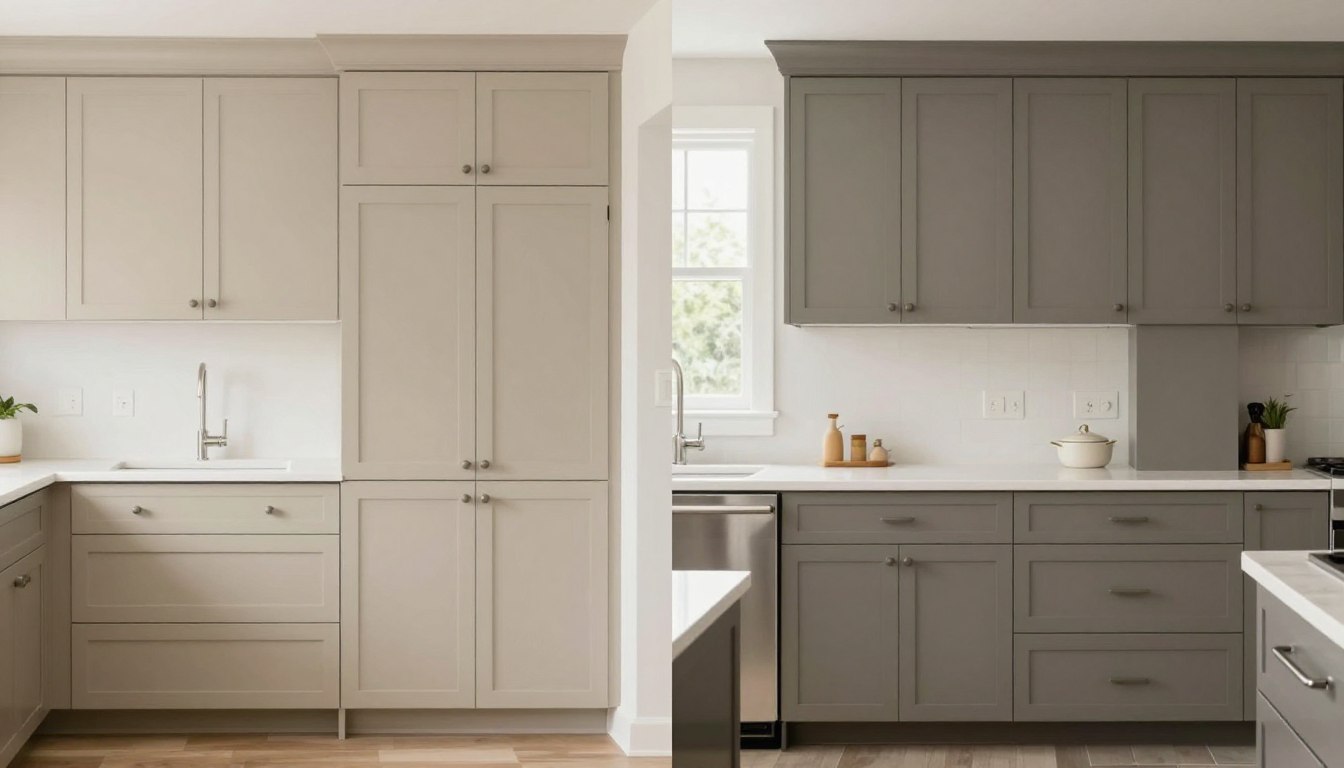
Choosing the right paint color for kitchen cabinets can transform your entire space. Two popular neutral choices dominate today’s kitchen design conversations: Sherwin Williams Accessible Beige and Benjamin Moore Light Taupe.
These sophisticated neutrals offer homeowners the perfect balance between timeless appeal and contemporary style. Understanding their unique characteristics helps you make a confident decision.
This comprehensive comparison explores undertones, lighting requirements, and practical applications. You’ll discover which color best suits your kitchen’s specific needs and design vision.
Understanding Sherwin Williams Accessible Beige
Sherwin Williams Accessible Beige stands as one of the most versatile greige paint colors available today. This sophisticated neutral has earned its reputation through consistent performance across various kitchen styles and lighting situations.

Color Characteristics and Undertones
Accessible Beige features distinct warm undertones that set it apart from cooler greige paint colors. The base color leans toward a warm gray beige with subtle violet and taupe influences.
This paint color achieves its warmth through careful formulation. The undertones shift slightly depending on natural light and surrounding elements in your kitchen.
Understanding these undertones helps predict how accessible beige cabinets will appear in your specific space. The color maintains consistency while adapting to different lighting situations.
Light Reflectance Value (LRV)
The accessible beige LRV measures 58, placing it firmly in the mid-tone range. This value indicates the color reflects a moderate amount of light back into your kitchen space.
An LRV of 58 provides excellent versatility for cabinet color applications. The shade offers enough depth to create visual interest without making small kitchens feel cramped.
LRV Impact on Kitchen Design
- Provides balanced light reflection for medium-sized kitchens
- Works well in spaces with moderate natural lighting
- Creates warmth without overwhelming smaller areas
- Pairs effectively with both light and dark accent colors

Optimal Lighting Conditions
Accessible beige performs exceptionally well in kitchens with abundant natural light. North-facing rooms benefit from its inherent warmth, while south-facing spaces showcase its greige paint color qualities.
Natural tan undertones become more pronounced in warm lighting situations. The color looks particularly stunning when natural light streams through windows during morning and afternoon hours.
Artificial lighting choices significantly impact how this cabinet color appears. Warm LED bulbs enhance the beige elements, while cooler lights emphasize the gray components.
Lighting Pro Tip: Test Accessible Beige samples in your kitchen at different times of day. Morning, afternoon, and evening light will each reveal different aspects of this complex neutral.
Exploring Benjamin Moore Light Taupe
Benjamin Moore Light Taupe represents a cooler approach to neutral kitchen cabinets. This sophisticated color delivers understated elegance while maintaining the versatility homeowners need.

Color Profile and Undertones
Light Taupe leans toward cooler territory with its gray beige foundation. The undertones carry subtle hints of gray and brown, creating a more restrained appearance than warmer alternatives.
This paint color maintains neutrality without veering into stark gray territory. The taupe element provides just enough warmth to prevent the color from feeling cold or institutional.
The balanced undertone structure makes Light Taupe adaptable to various design styles. From contemporary to traditional, this color serves as an excellent neutral base.
Light Reflectance Value Analysis
Light Taupe carries an LRV of approximately 52, slightly lower than Accessible Beige. This measurement places it in the medium-light range for paint colors.
The lower LRV creates a more grounded appearance in kitchen spaces. Cabinets painted in this color provide subtle definition without creating heavy visual weight.
Best Lighting Scenarios
Light Taupe excels in kitchens with ample natural light exposure. The cooler undertones balance bright, sun-filled spaces without appearing washed out.
South and west-facing kitchens showcase this color beautifully. The abundant warm natural light prevents the cooler tones from reading as too gray or flat.
Artificial lighting requires careful consideration with Light Taupe cabinets. Warm LED lights bring out the beige elements, while cool lighting emphasizes the gray components.
Accessible Beige vs Light Taupe: Direct Comparison
Comparing these two popular neutral colors reveals distinct differences in warmth, depth, and application. Understanding these variations guides your cabinet color selection process.

Temperature and Undertone Differences
The temperature difference between these colors fundamentally affects their kitchen appearance. Accessible Beige reads warmer due to its violet and beige undertones, while Light Taupe maintains a cooler gray beige presence.
Sherwin Williams Accessible Beige creates inviting, cozy kitchen environments. The warmer undertones complement wood elements and create a welcoming atmosphere.
Light Taupe delivers a more contemporary, refined aesthetic. The cooler base works exceptionally well in modern kitchen designs with clean lines and minimal ornamentation.
Visual Impact in Kitchen Spaces
Accessible beige cabinets tend to make kitchens feel warmer and more traditional. The color pairs naturally with classic design elements and creates timeless appeal.
Light Taupe cabinets contribute to a more contemporary kitchen look. The restrained color palette supports minimalist design principles and modern aesthetics.
Both colors maintain their neutral status while offering distinct personality. Your choice depends on the overall atmosphere you want to create in your kitchen space
Traditional Kitchen Applications
Traditional kitchens benefit from the warmth accessible beige provides. The color complements classic cabinet details, crown molding, and ornate hardware beautifully.

Sherwin Williams accessible beige creates the warm, inviting atmosphere traditional kitchens require. The undertones harmonize with wood flooring and natural materials common in classic designs.
Light Taupe can work in traditional settings but requires careful balance. The cooler tones need warmer accents and natural wood elements to prevent the space from feeling too modern.
Contemporary and Modern Kitchen Designs
Modern kitchens showcase Light Taupe exceptionally well. The restrained color palette supports clean lines and minimalist design principles effectively.
The cooler gray beige tone complements stainless steel appliances and contemporary hardware finishes. Light Taupe cabinets create sophisticated backdrops for bold accent wall colors.

Accessible beige works in modern kitchens when paired with the right elements. White countertops and cool-toned backsplashes balance the warmer undertones successfully.
Small Kitchen Considerations
Small kitchens require strategic color choices to maximize perceived space. The accessible beige LRV of 58 reflects sufficient light to keep compact kitchens feeling open.
Light Taupe’s lower LRV creates slightly more visual weight. However, in bright, well-lit small kitchens, this difference becomes minimal.
Accessible Beige for Small Kitchens
- Higher LRV brightens limited space
- Warm tones create cozy atmosphere
- Works well with white ceilings
- Pairs with light-colored flooring
- Reduces need for excessive lighting
Light Taupe for Small Kitchens
- Creates sophisticated, airy feel
- Requires abundant natural light
- Benefits from white or light walls
- Pairs with reflective surfaces
- Needs strategic lighting plan
Large Open Kitchen Layouts
Spacious kitchens accommodate either color choice successfully. Large spaces provide flexibility to incorporate both warm and cool design elements.
Accessible beige cabinets anchor large kitchens with warmth. The color prevents expansive spaces from feeling cold or institutional.
Light Taupe works beautifully in large, well-lit kitchens. The cooler tones create sophisticated, gallery-like atmospheres in generous spaces.
Pairing with Countertops, Backsplashes, and Hardware
Successful kitchen design requires harmonious pairing of cabinet color with surrounding elements. Strategic combinations enhance both accessible beige and Light Taupe applications.

Countertop Combinations
White countertops pair exceptionally well with both cabinet colors. Materials like white quartz, marble, or solid surface create clean, timeless looks.
Accessible beige cabinets complement warmer countertop options beautifully. Cream-colored quartz, beige granite, or warm marble enhance the color’s inherent warmth.
Light Taupe cabinets shine with cooler countertop selections. Gray quartz, white marble with gray veining, or concrete-look surfaces reinforce the contemporary aesthetic.
Best Countertops for Accessible Beige
- White Dove quartz or marble
- Warm beige granite varieties
- Cream-colored solid surface
- Light tan natural stone
- Warm gray quartz options
Best Countertops for Light Taupe
- Pure white quartz or marble
- Cool gray granite selections
- White with gray veining
- Concrete look surfaces
- Cool toned natural stone
Backsplash Selections
Backsplash choices significantly impact how your cabinet color reads in the overall kitchen design. The right backsplash enhances your chosen neutral beautifully.
White subway tile remains a classic choice for accessible beige cabinets. The combination creates fresh, timeless appeal that works across design styles.
Light Taupe cabinets pair well with white, gray, or mixed-tone backsplashes. Glass tiles in cool tones complement the cabinet color’s sophisticated nature.

Hardware and Fixture Finishes
Hardware selection completes your kitchen cabinet transformation. The right finish enhances your paint color choice while supporting your design vision.
Brushed nickel and chrome hardware complement both colors effectively. These neutral metal finishes provide contemporary appeal without competing with cabinet tones.
Accessible beige pairs beautifully with warmer hardware finishes. Brass, bronze, or gold-toned hardware enhances the color’s warm undertones.
Light Taupe works exceptionally well with cooler hardware selections. Polished chrome, brushed nickel, or stainless steel finishes reinforce the modern aesthetic.
Wall Color Coordination
Wall color selection impacts how your cabinet color appears in the overall kitchen. Coordinating walls with cabinets creates cohesive, well-designed spaces.
White walls work beautifully with both cabinet colors. Options like Sherwin Williams White Dove or Benjamin Moore Simply White provide clean backdrops.
For accessible beige cabinets, consider wall colors in the same warm neutral family. Lighter or darker variations create subtle contrast while maintaining warmth.
Light Taupe cabinets pair well with cooler wall selections. Light gray, soft blue-gray, or crisp white walls complement the cabinet’s sophisticated tones.
Practical Considerations: Maintenance and Value
Beyond aesthetics, practical factors influence your cabinet color decision. Maintenance requirements and resale considerations deserve careful attention.
Durability and Maintenance
Both accessible beige and Light Taupe hide everyday wear better than stark white cabinets. The mid-tone nature of these colors conceals minor imperfections and daily use marks.

Accessible beige cabinets maintain their appearance with regular cleaning. The warmer undertones help disguise light dust and fingerprints between cleanings.
Light Taupe similarly offers practical maintenance benefits. The color’s depth hides minor surface issues while still appearing fresh and clean.
Maintenance Advantages
- Both colors hide fingerprints better than white
- Mid-tone LRV conceals minor scratches
- Standard cleaning products work effectively
- Colors don’t show yellowing over time
- Touch-ups blend seamlessly when needed
Maintenance Considerations
- Darker colors show dust more than lighter ones
- Exact color matching for touch-ups requires care
- High-traffic areas may show wear patterns
- Regular cleaning maintains color integrity
- Quality paint application affects longevity
Resale Value Impact
Neutral kitchen cabinets significantly enhance home resale value. Both accessible beige and Light Taupe appeal to broad buyer demographics.
Sherwin Williams accessible beige creates universally appealing kitchens. The warm neutral tone resonates with traditional and contemporary buyers alike.
Light Taupe attracts design-conscious buyers seeking sophisticated spaces. The color signals updated, well-maintained homes to potential purchasers.
Real estate professionals consistently recommend neutral cabinet colors. These selections allow buyers to envision their belongings in the space easily.
Long-term Design Flexibility
Both colors provide excellent foundations for evolving design preferences. You can update accessories, hardware, and accent wall colors without repainting cabinets.
Accessible beige accommodates style shifts from traditional to transitional designs. The versatile base supports various decorating directions over time.
Light Taupe offers similar flexibility within contemporary and modern style ranges. The neutral foundation adapts to changing design trends gracefully.
How Lighting Transforms These Colors
Lighting conditions dramatically affect how paint colors appear in kitchen spaces. Understanding these effects prevents costly color selection mistakes.

Natural Light Variations
Natural light direction and intensity significantly impact cabinet color appearance. North-facing kitchens receive cooler, indirect light throughout the day.
Accessible beige performs exceptionally in north-facing spaces. The warm undertones compensate for cooler natural lighting, creating balanced, inviting atmospheres.
South-facing kitchens receive abundant warm sunlight. Light Taupe cabinets benefit from this exposure, with the natural warmth preventing the color from appearing too cool.
East-facing kitchens enjoy bright morning light that transitions to indirect afternoon illumination. Both colors adapt well to these changing lighting situations.
West-facing spaces experience dramatic afternoon and evening sun. This intense warm light enhances accessible beige while balancing Light Taupe’s cooler base.
Artificial Lighting Strategies
Kitchen lighting design affects cabinet color perception as much as natural light. LED technology offers control over color temperature.
Warm white LEDs (2700K-3000K) enhance accessible beige beautifully. These bulbs emphasize the color’s beige and taupe elements while adding coziness.
Neutral white LEDs (3500K-4100K) work well with both colors. This range provides balanced illumination without drastically shifting perceived cabinet color.
Lighting Warning: Cool white or daylight LEDs (5000K+) can make both accessible beige and Light Taupe appear flat and institutional. Avoid these color temperatures in kitchen applications unless specifically seeking clinical aesthetics.
Layered lighting approaches optimize cabinet color appearance. Combining ambient ceiling lights with under cabinet task lighting creates dimensional, appealing spaces.
Comparing Similar Colors from Other Brands
While accessible beige and Light Taupe represent excellent choices, exploring similar options provides additional perspective. Several competing paint colors offer comparable characteristics.
Sherwin Williams Alternatives
Agreeable Gray serves as another popular Sherwin Williams option. This greige paint color reads slightly cooler than accessible beige while maintaining warmth.
Natural Tan from Sherwin Williams offers warmer characteristics. The color features more pronounced beige undertones compared to accessible beige warmer applications.

Benjamin Moore Comparable Options
Edgecomb Gray represents Benjamin Moore’s answer to warm neutrals. This versatile greige paint color compares closely to accessible beige in warmth and versatility.
Revere Pewter offers another sophisticated neutral option. The color features balanced warm and cool undertones that work across various kitchen styles.
These Benjamin Moore alternatives provide additional choices for homeowners seeking perfect neutral cabinet colors. Each offers unique undertone combinations worth considering.
Cross Brand Comparisons
Understanding how colors from different manufacturers compare helps informed decision-making. While Sherwin Williams accessible beige and Benjamin Moore alternatives differ slightly, they occupy similar design territories.
Testing samples from multiple brands ensures optimal color selection. Paint manufacturers formulate colors differently, creating subtle but noticeable variations.
Professional Application Tips
Proper paint application ensures your chosen cabinet color looks its absolute best. Professional techniques deliver superior, long-lasting results.

Surface Preparation Requirements
Cabinet preparation determines paint adhesion and final appearance. Thorough cleaning removes grease, cooking residue, and surface contaminants.
Light sanding creates tooth for paint adhesion. Use 220-grit sandpaper to scuff existing finishes without creating deep scratches.
Proper priming ensures color accuracy and coverage. High-quality primers prevent tannin bleed-through and create uniform base coats.
- Remove all cabinet hardware and doors
- Clean surfaces thoroughly with degreaser
- Sand lightly with 220-grit sandpaper
- Wipe clean with tack cloth
- Apply quality primer coat
- Sand primer lightly when dry
- Apply first paint coat
- Sand between coats as needed
- Apply final coat for even coverage
- Cure properly before reinstalling hardware
Paint Product Selection
Professional-grade cabinet paint delivers superior results compared to standard wall paint. Specialized formulations resist kitchen moisture and daily wear.
Both Sherwin Williams and Benjamin Moore offer dedicated cabinet paint lines. These products provide excellent flow, leveling, and durability.
Consider finish selection carefully for kitchen cabinets. Satin and semi-gloss finishes balance durability with aesthetic appeal.
Application Techniques
Spray application provides the smoothest cabinet finish. Professional spray equipment eliminates brush marks and creates factory-like results.
High-quality brush and roller application works well for DIY projects. Premium tools minimize texture and deliver professional-looking outcomes.
Multiple thin coats outperform single heavy applications. Build color gradually while avoiding drips, sags, and uneven coverage.
Real Kitchen Transformations
Examining real applications demonstrates how these colors perform in actual kitchen environments. These examples showcase diverse applications across different styles and spaces.
Accessible Beige Success Stories
A traditional colonial kitchen benefited from accessible beige cabinet transformation. The warm neutral complemented original wood flooring while updating the dated honey oak cabinets.

A mid-century ranch kitchen used accessible beige to bridge vintage and contemporary elements. The color honored the home’s period while providing fresh, updated appeal.
These transformations demonstrate accessible beige good performance across architectural styles. The versatile color adapts to various design requirements successfully.
Light Taupe Transformations
A modern loft kitchen showcased Light Taupe’s sophisticated potential. The cool neutral complemented concrete countertops and stainless appliances perfectly.

A coastal cottage kitchen paired Light Taupe cabinets with white shiplap walls. The combination created serene, beach-inspired atmosphere while maintaining sophistication.
These applications prove Light Taupe’s versatility extends beyond purely modern settings. The color adapts to various interpretations when paired thoughtfully.
Making Your Final Color Decision
Selecting between accessible beige and Light Taupe requires evaluating multiple factors specific to your kitchen. This systematic approach ensures confident decision-making.
Decision Framework
Begin by assessing your kitchen’s natural lighting direction and quantity. This fundamental characteristic significantly influences which color performs better.
Consider your existing design elements that will remain. Flooring, countertops, and appliances all factor into color compatibility.
Evaluate your personal style preferences and long-term design vision. Choose the color that aligns with both current needs and future flexibility.
Choose Accessible Beige If:
Your kitchen and design preferences match these characteristics:
- North or east-facing kitchen orientation
- Traditional or transitional design style
- Desire for warm, inviting atmosphere
- Existing warm wood or beige elements
Choose Light Taupe If:
Your space and aesthetic align with these factors:
- South or west-facing abundant light
- Contemporary or modern design style
- Preference for sophisticated coolness
- Cool-toned existing materials
Consider Other Factors:
Additional elements that influence your choice:
- Resale market preferences in your area
- Adjacent room colors and flow
- Personal color sensitivity and preferences
- Budget for complementary updates
Testing Protocol:
Steps to validate your color choice:
- Purchase sample sizes of both colors
- Paint large poster boards for testing
- View samples at different times of day
- Compare with existing materials
Sample Testing Best Practices
Never commit to cabinet color without thorough sample testing. Purchase sample sizes and paint large boards for accurate evaluation.
Place sample boards on actual cabinets or in cabinet locations. View them throughout full day cycles to observe lighting variations.
Compare samples against your countertops, backsplash, and flooring. This real-world testing prevents expensive color mistakes.
Live with samples for at least one week before deciding. Initial impressions sometimes differ from longer-term reactions to colors.
Conclusion: Your Path to Beautiful Kitchen Cabinets
Both Sherwin Williams Accessible Beige and Benjamin Moore Light Taupe offer exceptional neutral options for kitchen cabinets. Your choice depends on your kitchen’s specific characteristics and your design vision.
Accessible beige provides warm, versatile appeal that works beautifully in traditional and transitional kitchens. The color’s inviting nature creates welcoming spaces while maintaining sophisticated neutrality.
Light Taupe delivers cool, contemporary elegance ideal for modern kitchen designs. The sophisticated neutral supports clean aesthetics while providing timeless appeal.
Consider your lighting conditions, existing materials, and personal style preferences carefully. Test samples thoroughly in your actual kitchen environment before committing.
Remember that professional guidance can prevent costly mistakes and ensure optimal results. Expert color consultants analyze your specific conditions to recommend the perfect cabinet color for your space.
Whichever color you choose, proper preparation and quality application ensure beautiful, long-lasting results. Your kitchen cabinets will provide years of enjoyment when you make informed color decisions.