A living room can have good furniture, the right rug, decent lighting and still feel unfinished. The walls are usually why.
Most people treat them as an afterthought. A painting here, a mirror there, nothing that was actually planned. The room ends up looking assembled rather than designed.
These 15 wall decor ideas for living room spaces are different. Each one comes with specific guidance on sizing, placement, and what to avoid because knowing what to put on the wall is only half the problem. The other half is knowing how.
How to Choose the Right Wall Decor for Your Living Room
Before you look at ideas, answer one question: what is the wall actually missing?
A room that feels flat and cold needs texture, not more objects. A room that feels disconnected where the eye doesn’t know where to land needs a focal point. A dark, cramped room needs reflective surfaces.

Most wall decor mistakes happen when people skip this question and just buy what looks good in photos..
Start With What the Room Needs, Not What You Like
If the wall feels empty, a large anchor piece or gallery arrangement fixes it. If the room feels visually flat, texture is the solution woven hangings, wood panels, or sculpted surfaces. If it feels dark or small, mirrors and lighter finishes are the fastest improvement.
Scale First, Style Second
A piece that’s too small looks accidental, no matter how expensive it is. A general rule: art or decor above furniture should span roughly two-thirds of the furniture’s width. It costs nothing to test this before you buy — tape newspaper to the wall in that shape and live with it for a day.
Light Changes Everything
A south-facing room with direct sun can carry dark frames, richer colors, and bold contrast. A dim north-facing room benefits from mirrors, lighter finishes, and textures that catch whatever light there is. The same piece can look completely different depending on which wall it goes on.
15 Wall Decor Ideas for Living Room (With Placement Guidance)
1. Textured Wall Panels: Depth Without Adding Objects

A textured panel changes the character of a room before you hang a single thing on it. The wall itself becomes the material.
Wood panels bring warmth. Reclaimed wood brings visible history. Fabric-covered panels felt, linen, acoustic weave absorb sound and soften the room’s harder edges. 3D panels create shadow that shifts as the light changes throughout the day.
Placement: Lightweight panels (fabric, thin 3D prints) can be adhered with construction adhesive applied in a zigzag pattern. Heavier wood panels need to be fastened into wall studs. Find the studs first the design decision comes after the structural one.
2. One Large Piece of Art: The Anchor Approach

One confident, well-sized artwork does more for a living room than six small ones. It creates a focal point. The eye arrives and stays.
The instinct to fill wall space with many small pieces usually backfires the result is visual noise, not personality.
Sizing: Use the 2/3 rule. Above a 90-inch sofa, the artwork should be roughly 60 inches wide. Bottom edge of the frame: 6–8 inches above the sofa back. If the center of the piece is above 60 inches from the floor, it’s hanging too high.
Framing: A floating frame where the artwork appears to sit within an air gap inside the frame reads as contemporary. A gallery wrap, where the image continues around the canvas edge, removes the frame entirely. Neither is better; the right choice depends on what else is in the room..
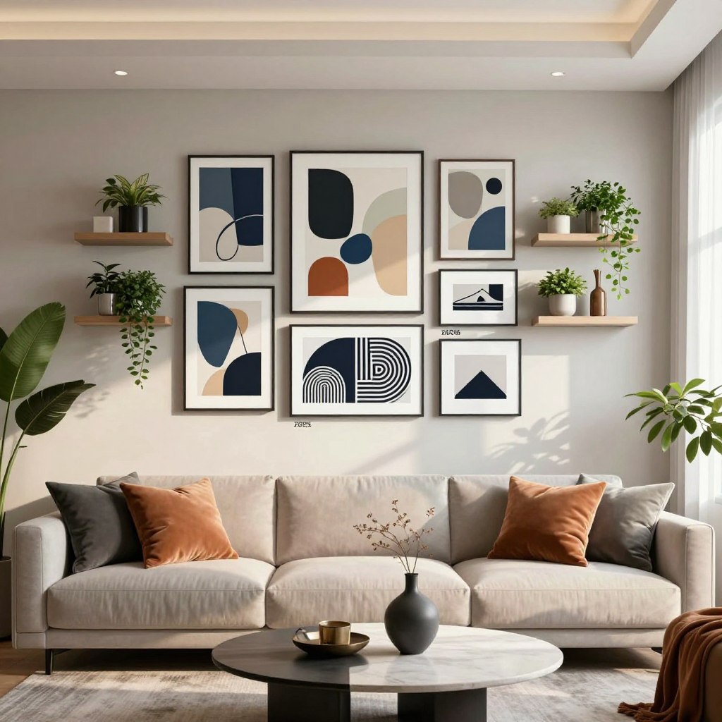
3. Gallery Walls Done With Restraint

A gallery wall done badly looks like clutter. Done with care, it reads like a room’s accumulated memory collected over time, not assembled in a weekend.
The difference is a unifying thread. Either a consistent frame material (all black, all natural wood, all raw metal) or a consistent color palette two or three tones that repeat across different pieces.
Planning it: Trace each piece onto kraft paper, cut out the templates, and tape them to the wall. Live with the arrangement for 24 hours before putting in a single nail. The tape comes off. Holes don’t.
Mixing formats: Small dimensional objects a ceramic plate, a woven basket, a sculptural form break up the flat plane of a gallery wall. One or two is enough. More than that and it stops feeling curated.
4. Statement Mirrors: Light, Space, and Proportion
A mirror does something no other wall decor element can: it changes the light in the room. It takes what exists and multiplies it.
In a north-facing room, a well-placed mirror can redirect daylight into corners that stay dim all afternoon.

Placement: Position a mirror adjacent to not directly across from a window. The goal is to redirect light, not bounce the window’s glare back at itself. And before you hang it, hold the mirror in position and look at what it reflects. A mirror facing a blank wall reflects a blank wall. Point it toward something worth seeing.
For ideas on how mirrors work above specific focal points, the living room mantle decor guide covers placement principles that apply above both fireplaces and sofas.
Frame style: Geometric frames hexagons, clean circles, angular polygons add structure and suit rooms with defined, linear furniture. Organic frames with irregular contours bring softness. A room full of hard angles often benefits more from one curved mirror than from any additional cushion.
5. Floating Shelves: When Storage Becomes Styling
A floating shelf holds objects and displays them at the same time. That dual function is exactly why it requires more care to execute well, not less.
An overfilled shelf looks like storage. A considered one looks like a decision.

Curating: Use odd numbers — three objects create a triangular relationship that the eye naturally reads as a composition. Vary height within each group: a tall vase next to a low stack of books next to a mid-height sculptural piece. That rhythm is what makes a shelf look styled rather than random.
Installation: Every floating shelf needs to anchor into a wall stud or a properly rated drywall anchor. Test stability before placing anything fragile or heavy. A good shelf bracket is invisible. One that fails takes everything with it.
For corners where shelves could solve a dead space problem, the guide to empty corners in the living room covers placement strategies worth reading alongside this.
Some reliable bracket options:
Heavy Duty Hidden Shelf Bracket 8-pack — invisible mount, works for a cleaner floating look
Goovilla Heavy Duty Floating Shelf Brackets, 6-pack — 160 lb. load capacity, 1/5 inch thick steel
Starunder 6 Pack Heavy Duty Shelf Brackets — industrial style, black finish, clean look
6. Wood Slat Accent Panels

Wood slats are having a serious moment in 2026 living rooms, and for good reason. They add rhythm and warmth to a wall without requiring you to hang anything on them the panel is the decor.
Vertical slats draw the eye upward, making ceilings feel taller. Horizontal slats widen a space visually. Both create movement as light travels across them through the day.
Placement: Works best as a full accent wall or a partial panel behind the sofa. Pair with matte, soft furnishings linen cushions, wool throws so the wood’s texture has something to contrast against. For a broader look at accent wall approaches, the living room accent wall guide covers material and panel options in more detail.
7. Living Walls and Air Plants
A living wall does something no static material can: it changes. New growth appears. The light shifts and the green responds.
Air plants (Tillandsia) are the most practical choice for an indoor living wall they need no soil, which eliminates the mess and the waterproofing concerns.

Choosing plants: Low-light varieties like Tillandsia ionantha and Tillandsia brachycaulos hold their form and color without direct sun. Note: “low light” still means indirect light. No air plant survives a room with no natural light at all.
Maintenance: Soak in room-temperature water for 20–30 minutes once a week. Shake off excess water, then let them dry inverted so moisture doesn’t pool at the base. In dry climates or winter, a mid-week misting extends the interval comfortably.
8. Wall Molding and Panel Details
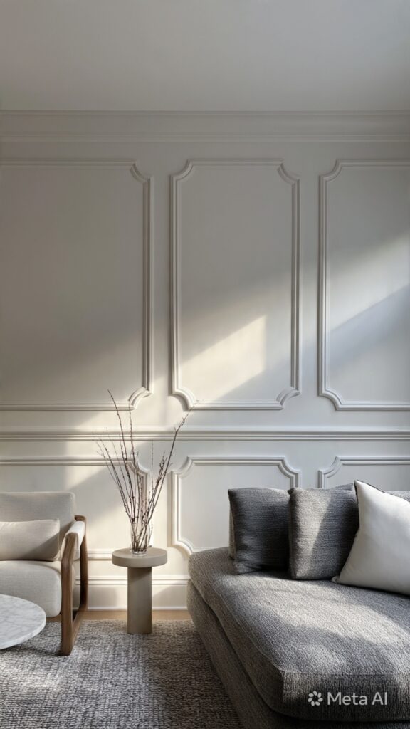
This is the quiet luxury move. Panel molding adds architectural detail to a plain wall depth, shadow, structure without a single object hung on it.
Done in the same color as the wall, it reads as subtle and refined. Done in a contrasting color, it becomes a statement. Both approaches work; the choice depends on whether you want the wall to whisper or to speak.
DIY-friendly: Standard MDF panel moulding strips can be cut to size and applied with construction adhesive plus a few finish nails. Paint over in the wall color, and the result looks custom without the custom price.
10. 3D Wall Sculptures: Form, Shadow, Material
A three-dimensional sculpture creates a different kind of presence than a framed piece. It projects into the room. It casts shadows that shift as the light moves. The wall becomes architectural.

Scale: For walls over 10 feet wide, look for sculpture spanning four to six feet, or plan a grouping. For standard walls, two to four feet gives presence without overwhelming. Leave 12–18 inches between the sculpture and the nearest furniture edge.
Materials: Wood adds warmth. Metal (laser-cut steel, hammered copper) creates precision and dramatic shadow. Resin allows fluid, translucent forms that interact with light differently from any opaque material.
Lighting it: A spotlight angled from above creates downward shadow and elongates form. Light angled from the side reveals texture across the surface. If the piece is positioned to receive morning or afternoon natural light, you may not need any additional installation at all.
11. Metallic Accent Walls
A metallic wall surface doesn’t just look different it behaves differently. It changes how light moves through the room at different times of day. That responsiveness over time is what makes a metallic wall interesting to live with.

Brushed vs. polished: Brushed metallic surfaces diffuse light softly. They read as textured rather than reflective, and minor marks become largely invisible. Polished surfaces reflect light dramatically and require consistent upkeep to stay clean.
Warm vs. cool: Gold, copper, and bronze tones extend the warmth of wood and earthy upholstery. Chrome, brushed nickel, and steel complement concrete, glass, and neutral palettes.
Balancing the room: Anchor a metallic surface with matte textures opposite it natural linen, raw wool, unfinished wood. Materials that absorb light rather than reflect it make both surfaces more interesting.
12. Digital Art Frames: When Technology Earns Its Place

Used well, a digital art frame is a surface that holds a rotating collection of works personal photographs, licensed art pieces without requiring permanent commitment to a single image. Used poorly, it looks like a television hung horizontally and left on.
What to look for: Minimum 4K resolution. Anti-glare treatment (especially in rooms with direct sunlight). Automatic brightness adjustment. Color accuracy matters more than most spec sheets suggest a frame with a wide color gamut renders art the way it was intended to look.
Curating: Art subscription services like Samsung Art Store and Meural’s NetGallery provide access to thousands of licensed works. Personal photography displayed at scale on a properly calibrated screen often looks better than printed versions.
13. Color Blocking: Paint as the Primary Material

Color blocking treats paint not as background but as the work itself. The wall becomes the decor — no frames, no objects, no shelving. Just paint, tape, patience, and a considered color relationship.
Geometric vs. organic: Sharp rectangles, clean diagonals, and precise angles bring structure — the intention reads clearly from across the room. Soft curves and brushed edges feel more fluid and introduce movement rather than architecture.
Executing clean lines: Quality painter’s tape applied to a clean, dry surface is the foundation. Press the edge down firmly with a putty knife to prevent bleeding. Paint the lighter color first when working with multiple tones. Remove the tape while the paint is dry to the touch but not fully cured pull at a 45-degree angle, slowly.
Furniture: A bold color block behind the sofa creates a defined zone. Keep the furniture colors quieter than the wall. The wall has earned the attention. Let it keep it.
14. Illuminated Wall Features: Light as Decor
Light is the most responsive material in a room. Designed into a wall surface, it becomes part of the room’s architecture.

LED strips vs. recessed wall washers: LED strips are flexible and adhesive. They work behind shelves, beneath panels, along the ceiling junction. They produce a linear glow that traces the edge of whatever surface contains them. Recessed wall washers are fixed into the wall or ceiling and produce a more controlled, architectural effect.
The effect: A floating shelf backlit with LED strips appears to hover. Objects on it gain depth against the glow behind them. Art with a soft halo reads like a museum display.
For a broader look at layering ambient, task, and accent light in a living room, the small living room lighting guide covers this in detail.
15. Natural and Sustainable Material Displays
Natural materials carry visible time. The grain of reclaimed wood, the pressed form of a dried botanical, the surface of cork each holds evidence of something that grew. That quality is difficult to replicate. It’s why sustainable material displays can anchor a room in a way manufactured finishes rarely do.

Reclaimed wood and cork: Reclaimed barn wood shows nail holes, weathering, and color variation that no new wood produces. These marks aren’t imperfections they’re the material’s record. Cork is warm, sound-absorbent, and renewable.
Pressed botanicals: Leaves, ferns, and flowers mounted in shadow boxes create displays that feel specific to the person who made them. Collected on a walk, pressed for weeks between books, framed simply the process is part of what makes the result feel real.
Care: Wood needs stable humidity (40–50%) to avoid cracking or warping. Pressed botanicals fade in direct sunlight UV-protective glass extends their life significantly.
Sizing Rules That Change How Every Idea Performs
These numbers apply across all 15 ideas above. Get them right and almost any piece looks considered. Get them wrong and even expensive decor looks off.
Eye-level rule: The center of any wall piece should sit 57–60 inches from the floor. That’s roughly eye level for most standing adults. Art hung higher than this floats. Art hung lower looks like it was placed by someone who ran out of energy.
The 2/3 rule: Art or decor above furniture (sofa, console, headboard) should span approximately two-thirds of the furniture’s width. A 90-inch sofa wants artwork about 60 inches wide. A 72-inch console wants something around 48 inches across.
The gap: Leave 6–8 inches between the bottom edge of wall decor and the top of the furniture beneath it. Less than 6 inches makes the two elements compete. More than 10 inches and they look unrelated.
For small rooms: One strong piece reads as more spacious than five weak ones. The guide to subtle colors for small living rooms covers how wall color and perceived space interact useful reading alongside any wall decor project.
Common Mistakes That Make Good Decor Look Bad
Hanging everything too high. The most common mistake, and the one that disconnects a wall from the rest of the room. When art floats above the furniture, the room looks like two separate designs stacked on top of each other.
Using pieces that are too small. A tiny frame on a large wall doesn’t look humble it looks like a placeholder. Scale is a design decision, not a luxury.
Filling every inch. Negative space matters. It lets the eye rest and makes each element more important. A wall with room to breathe looks more designed than one packed to capacity.
Mixing too many styles with no thread. Eclectic can work. Eclectic with no common element no repeated color, finish, or visual weight just looks confused.
Ignoring the TV wall. A television left on its own in the room looks accidental. Shelf units, panel surround, flanking art any of these make the screen feel intentional. Treat the TV wall as a design problem to solve, not an appliance to hide.
Forgetting what the mirror reflects. Before hanging a mirror, hold it in position and look at the reflection. If it shows a cluttered corner, it will show that forever. Point it toward something worth seeing.
How to Combine These Wall Decor Ideas
Two or three ideas working together almost always beats one idea at high volume. The question isn’t which approach is most impressive it’s which ones belong in the same room.

Layering it: Think background, middle ground, foreground. A textured panel or color-blocked wall is the background. Large art or a mirror sits in the middle ground on the surface plane of the wall itself. Floating shelves, sculptures, and plants project forward into the room. Three layers give a wall spatial depth that a flat arrangement cannot.
The 60-30-10 rule: Sixty percent of the wall’s visual weight goes to the dominant element. Thirty percent to secondary elements. Ten percent to small accents that catch the eye up close. This hierarchy lets the room know what to look at first.
FAQ
How high should wall art be hung in a living room?
The center of a piece should sit approximately 57–60 inches from the floor. Above furniture, place the bottom edge of the frame 6–8 inches above the furniture’s top edge. Hanging art too high is by far the most common mistake when the art isn’t visually connected to what’s below it, the wall feels unresolved.
What is the 2/3 rule for wall art above a sofa?
Art above a sofa should span roughly two-thirds of the sofa’s width. For a 90-inch sofa, that means a piece or grouping around 60 inches wide. Too narrow looks accidental; too wide overwhelms the furniture beneath it.
What wall decor makes a small living room look bigger?
A large mirror placed next to (not directly across from) a window doubles perceived light. One large piece of art reads as more spacious than several small ones. Vertical elements — a tall woven hanging, a panel that runs floor to ceiling — draw the eye upward and make the ceiling feel higher.
Can I mix different wall decor styles in the same room?
Yes, with a plan. Choose one dominant element for each wall. A statement mirror on one side, a gallery arrangement on another. What ties them together is a repeated color, material, or visual weight not matching styles.
What size art goes above a sofa?
Follow the 2/3 rule: the piece or grouping should span about two-thirds of the sofa’s width. For a standard 84-inch sofa, aim for something around 56 inches wide. Bottom edge of the frame: 6–8 inches above the sofa back.
The Short Version
Every living room wall is already doing something. A blank wall creates absence. A too-small piece creates imbalance. A mirror placed without thought reflects the wrong thing.
The wall was never neutral.
These 15 wall decor ideas for living room spaces aren’t a shopping list. They’re a framework for making deliberate decisions about surfaces that are already shaping the room whether or not you’ve thought about them yet.
Start with what the room is missing. Match the scale to the furniture. Use the sizing rules. And don’t hang anything until you know what the mirror will reflect.
That’s most of it, honestly.