Color is the cheapest renovation you’ll ever do. A kitchen refresh doesn’t stop at cabinet color either once you’ve landed on a palette, the right kitchen mat can pull the whole look together underfoot. A fresh set of kitchen cabinets can cost $10,000 to $30,000. Repainting them? A few hundred dollars and a weekend. That’s why picking the right color matters so much it does most of the heavy lifting.
The problem is that kitchen colors that looked current five years ago already feel dated. Cool gray? On the way out. Stark white? Losing ground fast. And the all-white kitchen that dominated every Pinterest board in 2018 is now so common it’s become the beige wallpaper of this decade.
In 2026, the colors that make kitchens feel expensive share one quality: they’re intentional. They say “I made a choice” rather than “I played it safe.” Here are 15 modern kitchen colors worth considering and what it actually takes to make each one work.
Quick answer for 2026: The most popular modern kitchen colors right now are sage green, deep navy, warm greige, matte black, and soft cream. Earth tones like terracotta and warm taupe are also gaining fast.
1. Sage Green
Sage is the kitchen color of 2026. Full stop. It’s been gaining for three years and now it’s everywhere — and the reason it keeps landing well is that it doesn’t feel like a trend. It feels settled, like it’s always been there.
The appeal is simple: sage sits between green and gray, which means it reads as a neutral in some lights and as a color in others. You get personality without commitment. It works in a farmhouse kitchen with a porcelain sink, in a sleek modern kitchen with handleless cabinets, and in a small rental kitchen where you’re just painting the lowers.
Pair it with white oak shelving, a white or light stone countertop, and brushed brass hardware. That’s the combination designers keep coming back to. If you want to try before committing to full cabinets, start with a cabinet paint sampler kit test three or four sage tones in natural and artificial light before buying a full gallon.
2. Deep Navy Blue
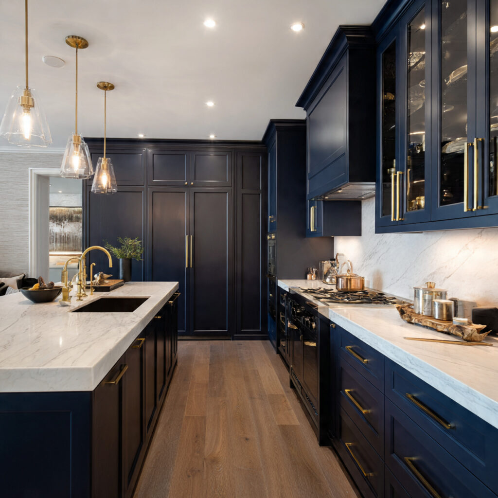
Navy has been building for years, and it’s now solidly mainstream in the best possible way. It’s dark enough to feel dramatic but grounded enough to not feel like a mistake five years from now.
It works best on lower cabinets or the island, paired with white or light gray uppers. That split lets the navy anchor the space without swallowing it. White quartz countertops create the crispest contrast. For hardware, go with brushed gold or unlacquered brass the warm metal against the deep blue is a combination that punches well above its price point.
One thing to know: navy in a low-light kitchen can feel heavy. Make sure you’ve got good task lighting under the uppers, or the whole room will read dark even if the walls are white.
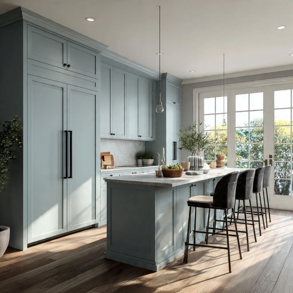
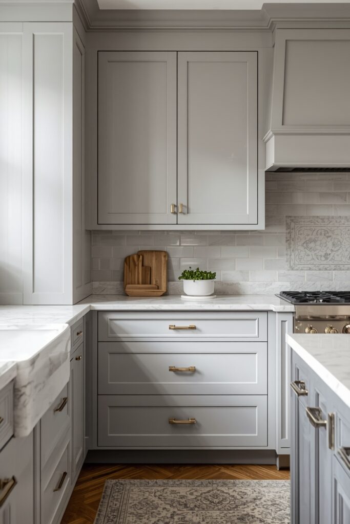
2. Dove Grey Neutrality with Depth
Greige — the blend of gray and beige — isn’t new. But the warm version of it is having a serious moment, and it’s different from the flat greige of 2015. This is richer, more complex, closer to a warm stone or aged linen. Interior designers call it a “complex neutral,” and that’s exactly right: it looks different under morning light than it does under kitchen spotlights.
The reason it keeps appearing in high-end kitchens is that it works with nearly everything. Natural stone countertops, warm wood floors, unlacquered brass, aged bronze it doesn’t fight any of it. It just holds space and lets the materials breathe.
If you’re not sure where to land on this, Benjamin Moore’s “Pale Oak” or Sherwin-Williams’ “Accessible Beige” are good warm greige starting points. Pull a few paint swatches and live with them for three days before committing.
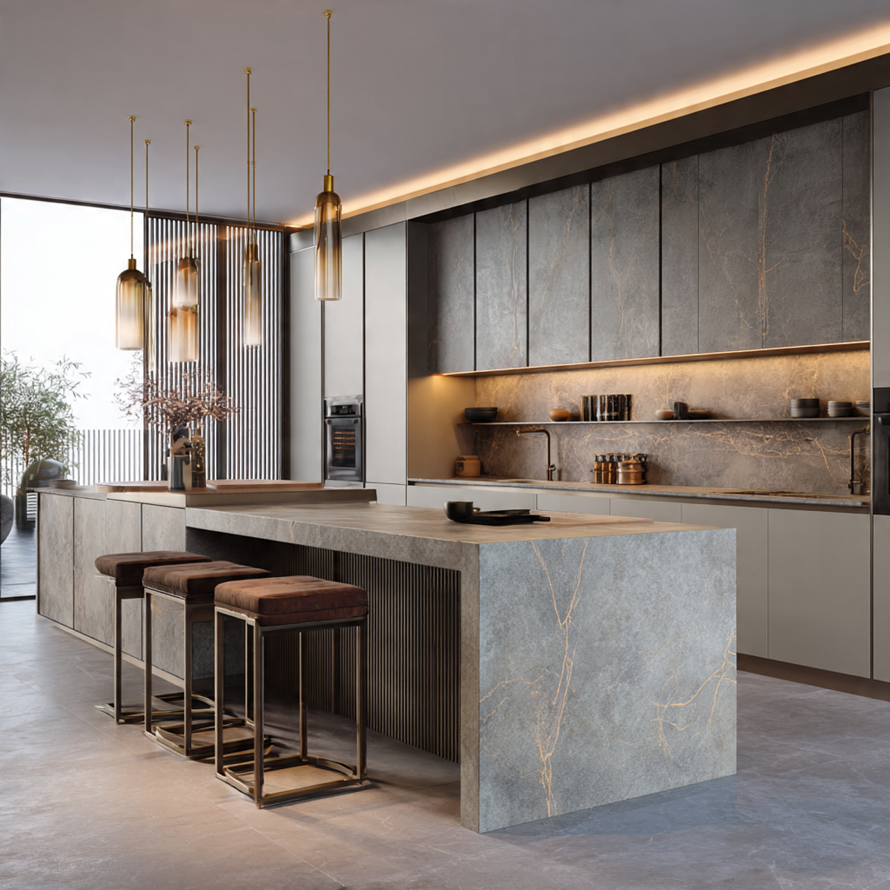
4. Matte Black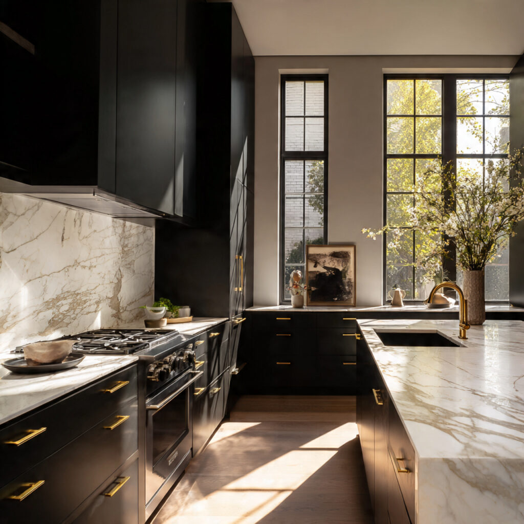
Matte black in a kitchen sounds risky. It’s not, if you approach it right.
The key is natural light. A matte black kitchen with great windows feels moody in the best way like a professional chef’s workspace, or something out of a Scandinavian design magazine. A matte black kitchen with no windows just feels like a cave.
It performs best as a color for lower cabinets and the island, with lighter uppers balancing the weight. Pair with veined white marble (or a quartz that mimics it) and warm wood accents so it doesn’t go cold. Matte black cabinet pulls are the cheapest way to test the aesthetic without committing to painting anything.
4. Soft Cream / Off-White
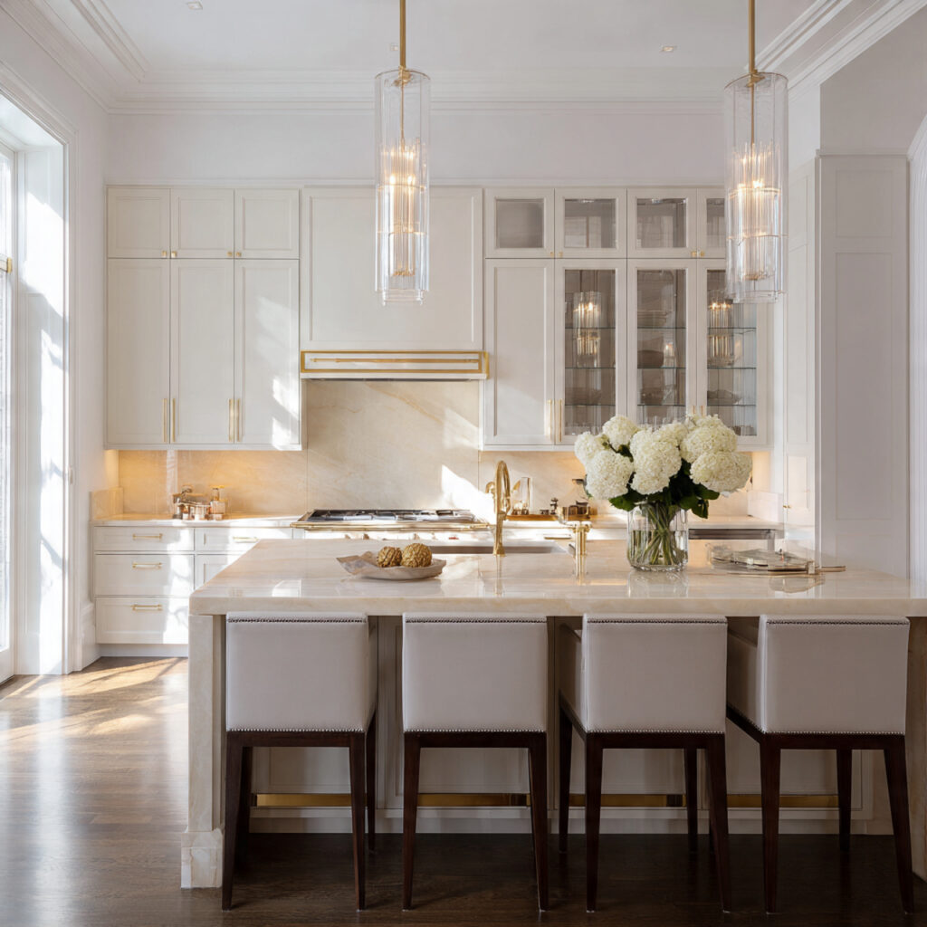
White kitchens aren’t dead. But the stark, clinical, builder-white kitchen is on its way out. What’s replacing it is softer: cream, ivory, linen, warm white tones that still feel clean but have enough warmth that they don’t feel like a hospital.
The practical advantage of soft cream over white is that it photographs better, ages better, and doesn’t show every fingerprint the way crisp white does. It’s also more forgiving when your lighting changes a warm-toned bulb won’t turn it yellow the way it does a cool white.
Pair with dark mahogany or walnut wood accents, or with champagne gold hardware for a look that feels quietly expensive. Avoid chrome or cool stainless steel those metals fight the warmth of cream instead of working with it.
6. Charcoal Gray

Charcoal is the grown-up version of the gray kitchen. Where mid-tone gray tends to look flat and uncommitted, charcoal has enough depth to feel intentional. It’s almost black but not quite and that “not quite” is what makes it sophisticated rather than dramatic.
It works especially well in kitchens with high ceilings or strong architectural details, where the dark color grounds the space rather than compressing it. Handleless cabinets in charcoal look almost sculptural. Add warm wood flooring or a butcher block countertop to stop it from reading too cold.
Skip chrome hardware. Go with warm metals brushed bronze, matte black, or aged brass. Any of those will make the charcoal feel warm rather than industrial.
7. Warm Taupe
Taupe often gets dismissed as the most boring neutral on the palette. The warm version of it, though, is something different. It has an earthy quality — it’s close to the color of raw linen, unpolished stone, or a sand beach in late afternoon light. Designers have started calling this category “quiet luxury,” and it fits.
It layers beautifully with natural textures: honed marble, wood grain, unlacquered brass that develops a patina over time. The combination doesn’t shout anything. It just feels expensive and considered.
This is a good color if you want a kitchen that photographs well in any season and feels calm to cook in every day. Pair with brushed brass cabinet hardware and a light stone backsplash.
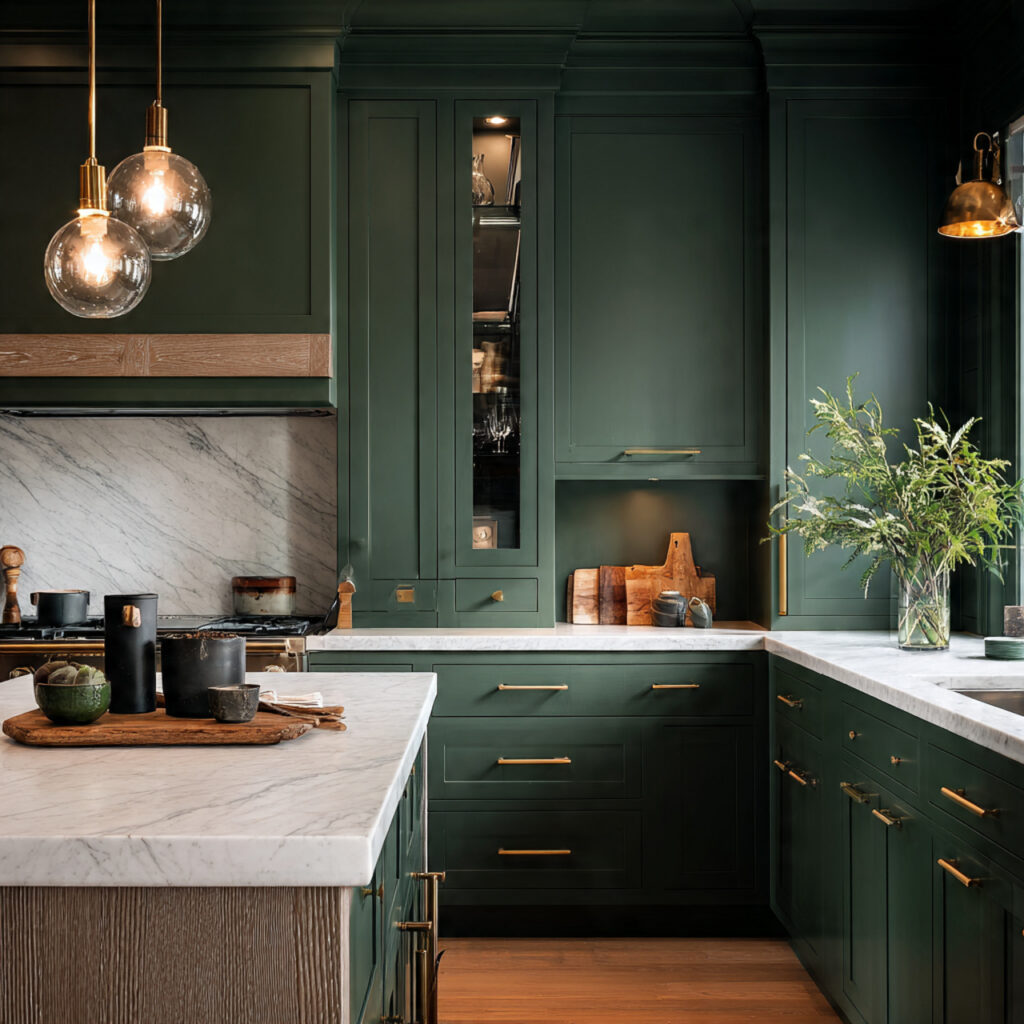
8. Deep Moss Green
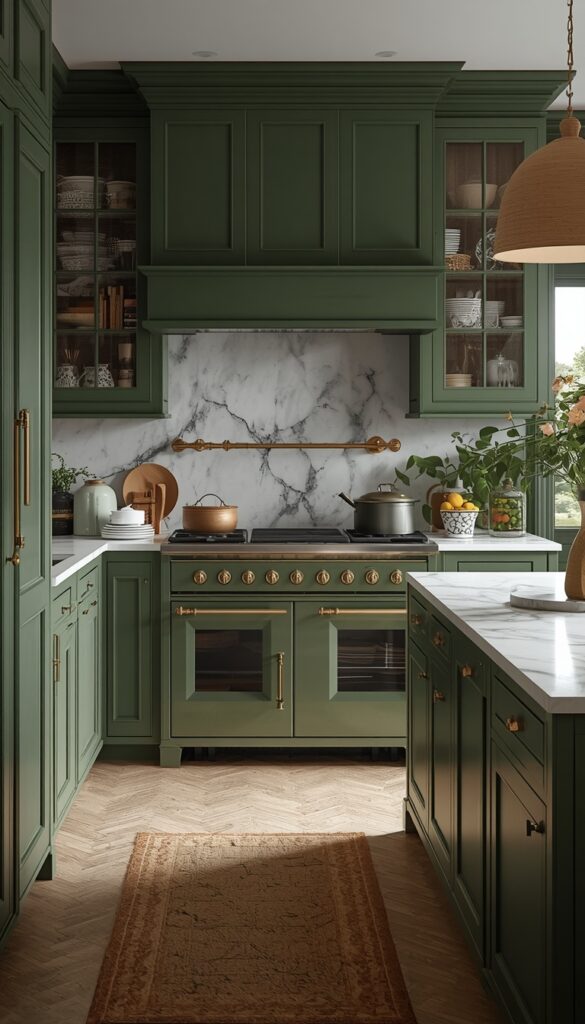
Where sage is calm and subtle, moss green makes a statement. It’s darker, richer, and much more saturated it has authority in a way that lighter greens don’t. If you want a kitchen that someone walks into and notices, this is the version of green that does it.
The key pairing is antique brass or unlacquered copper hardware. Those warm metals pull out the depth in the green and make the whole thing feel like a boutique kitchen in an Italian countryside house. Pair with Italian Carrara marble or a white quartz with gray veining. And if you’re going bold with the cabinets, choosing the right backsplash is what ties the whole room together.
If you’re not ready to do the whole kitchen, the island or the lower cabinets only is enough to get the effect. Keep the upper cabinets white or cream and let the moss green anchor the base.
9. Misty Blue
Misty blue sits exactly between sky blue and gray, and its superpower is that it makes a kitchen feel bigger. It’s light without being white, colorful without being loud. Used on floor-to-ceiling cabinets, it pushes the walls out visually a useful trick in any kitchen that isn’t huge.
It’s also the most calming color on this list. There’s a reason it keeps appearing in kitchens with a Scandinavian or coastal aesthetic: it feels like good ventilation.
Pair with matte black hardware for a modern, grounded look, or with brushed nickel for something softer. Keep the countertops light white or pale quartz so the blue can breathe.
10. Terracotta / Clay
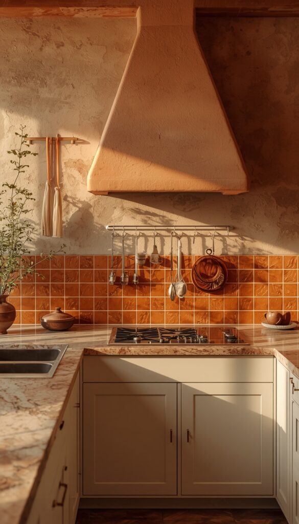
Terracotta was everywhere in living rooms and bedrooms a few years ago, and it’s now moving into kitchens in a meaningful way. Specifically: as a backsplash tile color paired with cream or warm white cabinets, or as a lower-cabinet accent in a Mediterranean-style kitchen.
It’s warm, organic, and distinctly not what everyone else is doing. That’s its main appeal. It brings a sense of handcraft and a slightly European quality especially when the backsplash is a handmade tile with variation in the glaze.
Don’t go full terracotta on every surface. Use it as the color moment the backsplash, the island, or the lower cabinets and let cream or off-white hold the rest of the space together. Peel-and-stick terracotta backsplash tile is a low-commitment way to test this before committing to the real thing.
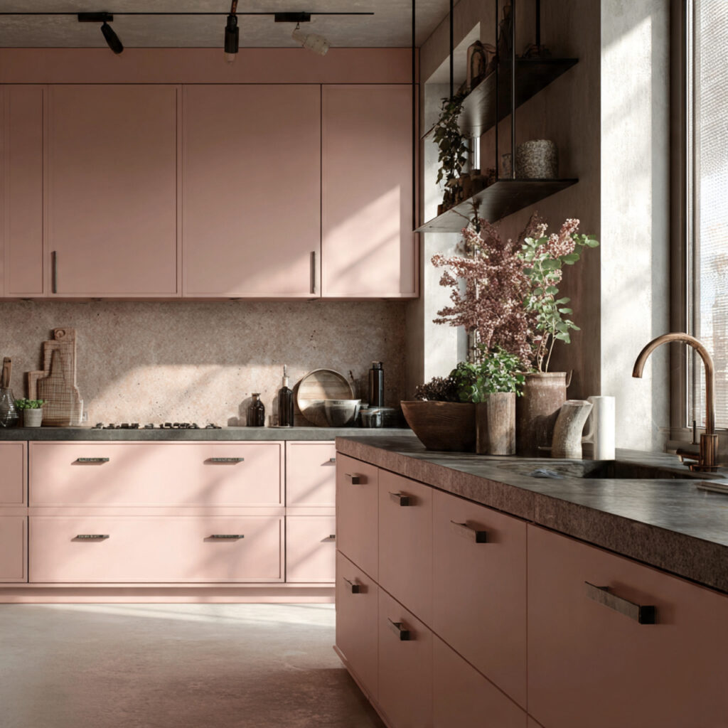
11. Dusty Rose / Nude Pink
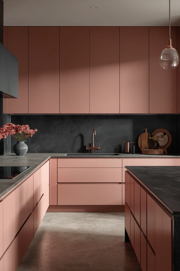
This is the riskiest color on the list, which is exactly why it’s worth talking about. Dusty rose in a kitchen is not a sweet, bubbly pink it’s a warm, muted nude with enough gray and brown in it to read as sophisticated rather than feminine.
Done well, it’s a genuine statement. It softens the harshness of metal and stone, makes the kitchen feel livable rather than showroom-perfect, and stands out from every navy and green kitchen on Instagram.
Done wrong, it looks like a kids’ bedroom. The difference is the pairing: use concrete countertops, black slate, or dark granite. Pair with brushed copper or black nickel hardware. Stay away from rose gold, white marble, and anything that pushes the pink softer that’s the direction where it gets lost.
12. Deep Burgundy / Marsala

Burgundy is a bold move, but it’s less bold than it looks because the red is so brown and brown-purple that it reads more like a dark earth tone than a statement red. It evokes something Italian and indulgent a wine cellar, a restaurant kitchen in Bologna.
It pairs naturally with white Carrara or Calacatta marble countertops, which give it the contrast it needs to pop without competing with it. Open wood shelving stacked with clear glass jars amplifies the “serious cook” quality of the color.
Keep the cabinet fronts flat and modern this is a color that needs simple geometry to keep it from feeling theatrical.
13. Teal + Natural Wood
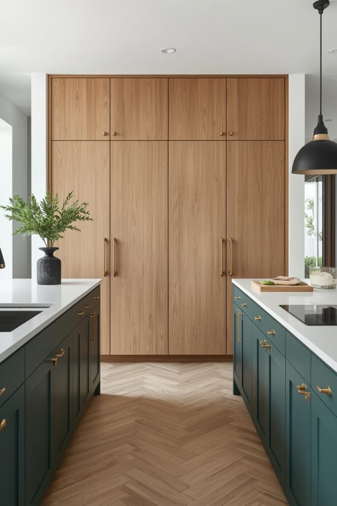
Teal isn’t just a cabinet color it’s a pairing strategy. Deep teal base cabinets with a tall natural wood pantry cabinet or open wood shelving is one of the strongest two-tone combinations trending in 2026. The teal grounds the lower half of the kitchen, and the wood brings warmth to the upper.
It works because they’re both doing the same thing in different ways: they’re both natural, grounded, slightly Scandinavian. They don’t fight each other.
Add brass hardware on the teal cabinets for a little polish, and keep the countertops light a pale butcher block or white quartz works well. The result is a kitchen that feels fresh and creative without being difficult to live with.
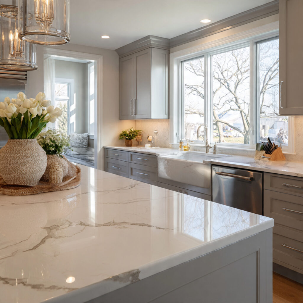
14. Dove Grey
Dove gray is the quietest choice on this list, and that’s the point. It doesn’t announce itself. It creates a backdrop. It lets the materials the veined marble, the aged brass, the handmade tile be the thing you notice when you walk in.
What separates dove gray from generic gray is its undertone: there’s a hint of lavender or blue in it that shifts depending on the light, which means it never looks flat. In a north-facing kitchen with cold light, it reads almost silver. In a south-facing kitchen in afternoon sun, it goes warmer, almost linen.
Pair with polished nickel hardware (not chrome nickel is warmer) and a quartz countertop with gray veining. It’s one of the most versatile kitchen colors going and one that will look current for years.
15. Deep Ochre / Mustard Yellow
Ochre is the color for someone who wants a personality-forward kitchen and doesn’t want to go dark to get it. It’s earthy yellow with enough brown and green mixed in that it reads grounded and mature rather than cheerful and bright.
The most successful applications keep it to the lower cabinets or an accent wall, paired with white or light gray uppers. That restraint lets the ochre be a feature rather than an assault. Pair with Shaker-style cabinet fronts — the frame highlights the handmade quality that ochre suggests.
Emerald green marble or teak wood are both excellent countertop companions. Either one pulls the ochre’s earthy quality forward without competing with it.
How to Choose the Right Color for Your Kitchen
Start with your light. A north-facing kitchen is cooler and needs warm colors cream, sage, taupe, ochre to counteract the blue light. A south-facing kitchen can handle cooler tones like navy, misty blue, or dove gray without going cold.
Then consider the size. Dark colors (charcoal, navy, matte black, moss green) work beautifully in larger kitchens with good natural light. In a smaller kitchen, they’re best kept to the island or lower cabinets only, with lighter uppers to prevent the room from feeling compressed.
Finally: test before you commit. Paint a large piece of cardboard in your shortlisted color and live with it for three days morning light, afternoon light, evening light. Colors behave completely differently across those conditions. A paint swatch fan deck is worth $10 for this reason alone.
Final Thoughts
Picking a kitchen color isn’t about chasing whatever’s trending on Instagram this month. It’s about choosing something you can live with for five to ten years while it also happens to look excellent right now. The 15 colors on this list do both. They’re current, they’re proven, and none of them will embarrass you in a decade.
Start with the color that feels right, test it properly, and don’t talk yourself out of a choice you love just because it’s a little unexpected. The unexpected ones are usually the ones people compliment. Once the walls and cabinets are sorted, small seasonal touches are what keep a kitchen feeling fresh without repainting every year.